
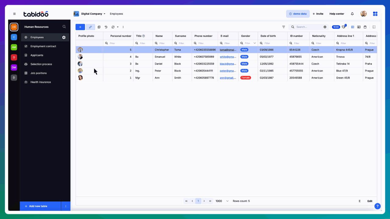
New Form Designer
How to Enable
The new Form Designer is not yet the default editor in Tabidoo. You can enable it as a beta feature in your application settings. Here’s how.
Step-by-step guide
- Open your Tabidoo application.
- Go to Edit Application → Advanced Settings → Tabidoo Labs.
- Find the card New Form Designer.
- Switch it ON (click).
- Save your changes.
Notes
- The feature is currently in beta, so you may encounter minor changes or updates.
- The setting is application-specific – once enabled, all users of the application will use the new Form Designer.
First Steps
Once enabled, you can access the new Form Designer directly from the table settings:
- Open the context menu for your table and select Table Fields.
- Click the Form Designer button.
- The new Form Designer will open.
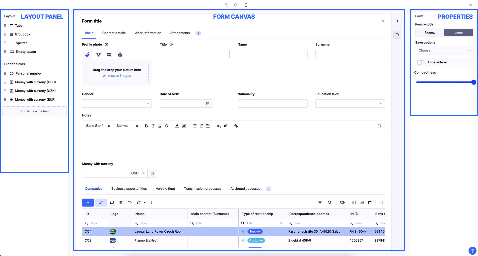
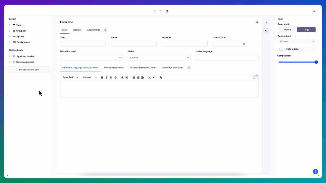
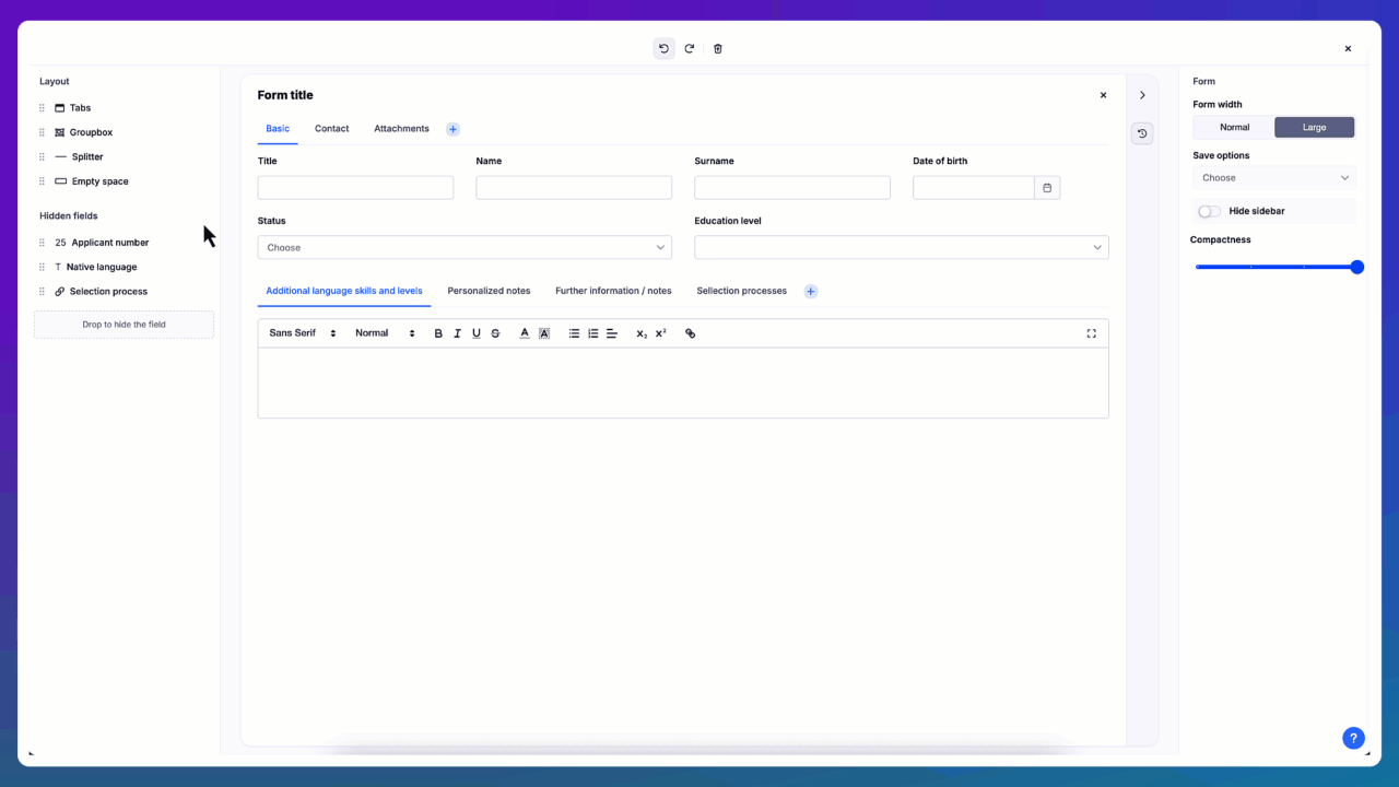
Main Areas of the Form Designer
When you open the designer, you’ll see three main sections:
Layout panel (left)
- Contains visual controls you can add (drag & drop) to the form (Tabs, Groupbox, Splitter).
- Area for hidden fields – you can drag fields here if you don’t want them on the form.
Form canvas (center)
- The main working area where you place and arrange fields and controls.
- Drag fields or controls here to build your form.
- Components in the same row automatically share the space proportionally.
Properties panel (right)
- Settings for the entire form and for selected components.
- Options like form width, save behavior, compactness, or specific properties of each field/control.
Next Steps
From here, you can start designing:
- Drag fields to the canvas and arrange them into rows and columns.
- Use Groupbox to organize related fields, Tabs for separating larger content, and Splitter to visually divide form areas with a vertical line.
- Adjust the look and behavior of each item using the properties panel.
Drag & Drop Interface
- Easily move fields and components around the form using drag-and-drop.
- Remove or hide fields by simply dragging them out of the form (to the Hidden fields area).
- Reorder elements at any time.
Layout Elements
The new designer includes special controls that make your forms clearer and more user-friendly:
- Groupbox – visually group related fields together.
- Tabs – organize content into multiple tabs.
- Splitter – visually separate form areas with a vertical line.
You can also nest components freely – for example, place Groupboxes inside Tabs, or Tabs inside a Groupbox. This allows you to create very structured and complex form layouts.
Form Settings
Form width
Choose the width of the form:
- Normal – standard form width.
- Large – wider form layout, useful when working with more fields side by side.
Save options
This setting changes the behavior of the Save button(s) on the form.
⚠️ Tip: Avoid enabling too many options at once – it may confuse users.
Available options:
- Save & Close (default) – Saves data and closes the form.
- Save & New – Saves data and opens a new blank form for another input.
- Save & Duplicate – Saves data and reopens the form with values prefilled from the saved record.
- Save & Stay – Saves data and keeps the current form open.
Hide sidebar
If enabled, the sidebar with additional information (such as audit data, logs, etc.) will not be displayed in the form.
Compactness
- Adjusts how dense the form layout is.
- Move the slider to make the form more compact (less spacing between fields) or more spacious.
Groupbox Settings
Label
- The displayed title of the Groupbox.
- Helps to clearly describe the grouped content.
Hide label
- If enabled, the Groupbox will not display its label.
- Useful when the grouping is only visual and a title would be redundant.
Background
- Allows you to set a background color for the Groupbox.
- Makes grouped fields visually distinct from the rest of the form.
Auto height
- Special setting for vertical space management.
- If there is free space in the form, the Groupbox expands to fill the remaining height.
- If the form is already filled with other components, the Groupbox will only take up as much space as needed by its content.
ID
- Internal identifier of the Groupbox.
- Can be used in scripting for conditional logic (e.g., show/hide).
- Example:
doo.form.forms.defaultForm.elements.groupbox1.isVisible = false;Tabs Settings
Tabs
- Displays a list of all tabs contained in the component.
- You can:
- Reorder tabs by dragging and dropping them.
- Open a tab’s detail to edit its label or settings.
- Add a new tab using the Add new item link.
Auto height
- Works the same way as with Groupbox.
- If free vertical space is available, the Tabs component expands to fill it.
- Otherwise, it will only take as much height as needed for its content.
ID
- Internal identifier of the Tabs component.
- Can be used in scripting for conditional logic (e.g., show/hide).
- Example:
doo.form.forms.defaultForm.elements.tabs1.isVisible = false;Splitter Settings
Color
- Sets the color of the horizontal line (splitter) that visually separates vertical areas of the form.
ID
- Internal identifier of the Splitter.
- Can be used in scripting for conditional logic (e.g., show/hide).
- Example:
doo.form.forms.defaultForm.elements.splitter1.isVisible = false;Scripting
Scripting allows you to dynamically control both fields and layout elements directly in the form.
Working with fields
Fields are accessible through the model object.
Examples:
// Hide a field
doo.model.firstname.isVisible = false;
// Make a field read-only
doo.model.surname.isReadOnly = true;
// Set value
doo.model.age.value = 25;
Working with layout elements
Layout elements are accessible through the doo.fom.forms.defaultForm object.
// Hide a layout element
doo.form.forms.defaultForm.elements.[yourElementName].isVisible = false;