
Widget - Charts
Charts are useful when you want to display your data on a bar, line, or pie chart and demonstrate important relationships between the data points.
Chart
Charts are useful when you want to display your data on a bar or line chart and demonstrate important relationships between the data points.
Chart Settings
- Data from the table - select the source for the chart, which can be:
- Table
- Custom data source (If you want to display data from the custom source, you have to define them first in the Data source extension)
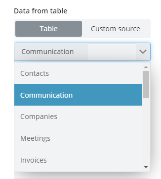
Select the source table
- Chart type - Select the chart type that can be:
- Bar
- Line
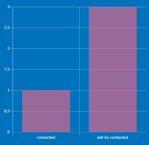
An example of the Bar chart in Tabidoo
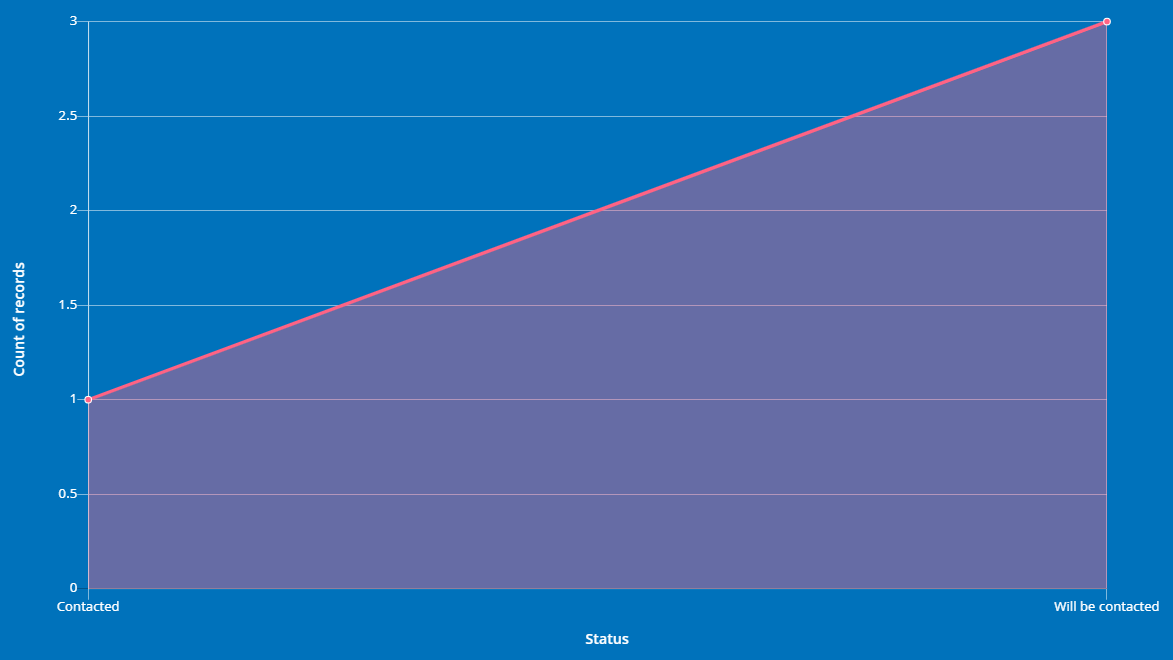
An example of the Line chart in Tabidoo
- X-axis - select the source fields from the table to display on the X-axis of the chart. Moreover, you can select whether the data will have an ascending or descending tendency.
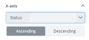
X-axis
- Y-axis - You can choose whether the data will be displayed as a count or if they will be grouped by any other field of the table. Set up then if those values will be ascending or descending.
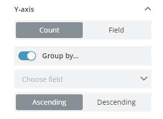
Y-axis
- Filters - Do you want to display only specific values from the fields? Use filters! What is more, you can link them with the already set up filters in the table, and click on - Link with user filters.
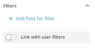
How to add filters to the chart in Tabidoo
- Formatting - Here you can add a unit prefix or suffix to X-axis or Y-axis (For example EUR, KG...). You can set up maximum fields to be displayed in the chart and what is more, you can as well set up how many items will appear when the graph will be opened on the full screen.
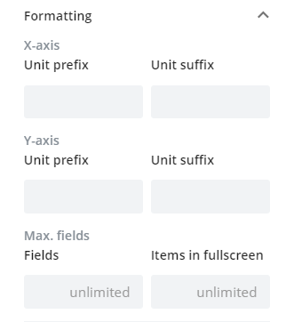
How to format a chart in Tabidoo
- Widget appearance - select the most suitable color for the background of the chart. Set up if the legend will be shown and if the data values will appear above each bar. Lastly, if the chart will stay vertical or will be switched to horizontal.
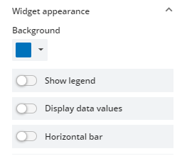
How to set up the widget appearance
Pie chart
This type of chart helps you to visualize your records on a pie or doughnut chart.
Pie Settings
In the comparison with the previous chart, there are only two differences in the settings and that is:
- Chart type - Select the chart type that can be:
- Pie
- Doughnut
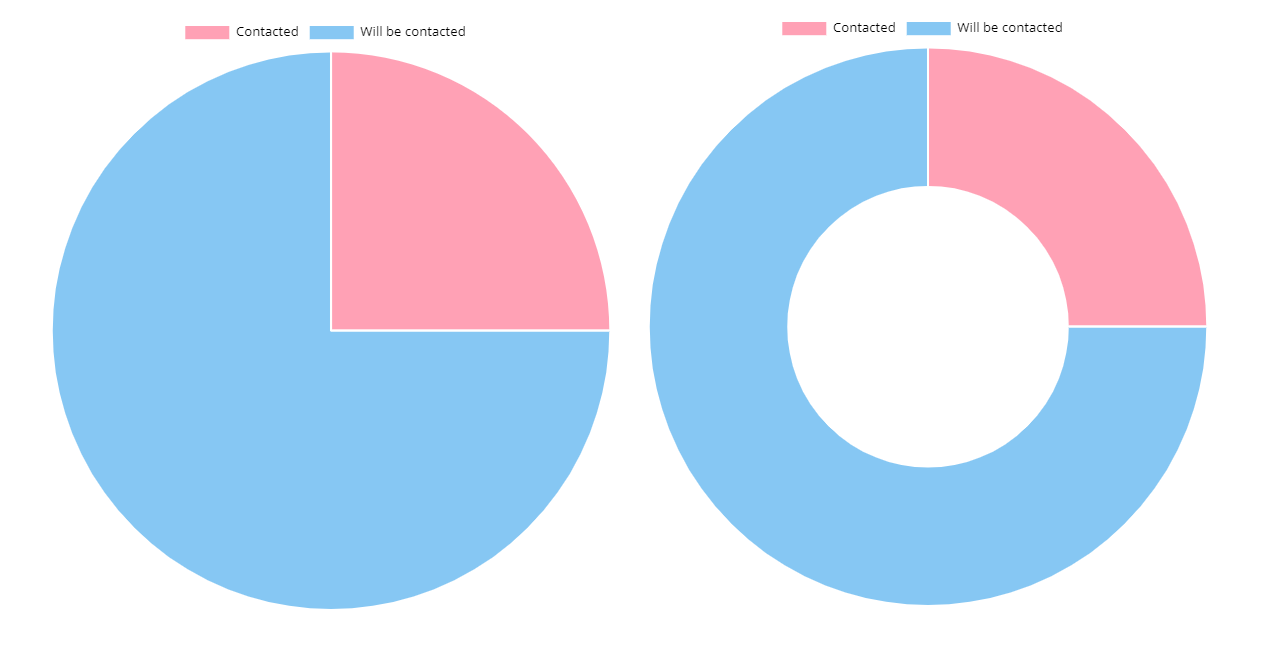
An example of the Pie and Doughnut chart in Tabidoo
- Group by field - You choose the source field from which you want the data to be displayed in the chart.
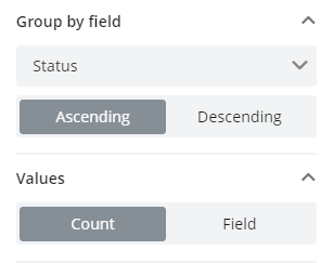
How to group by field in the Pie chart
The rest of the settings remain the same as for the previous widget.