
Widget - Pivot table
Overview
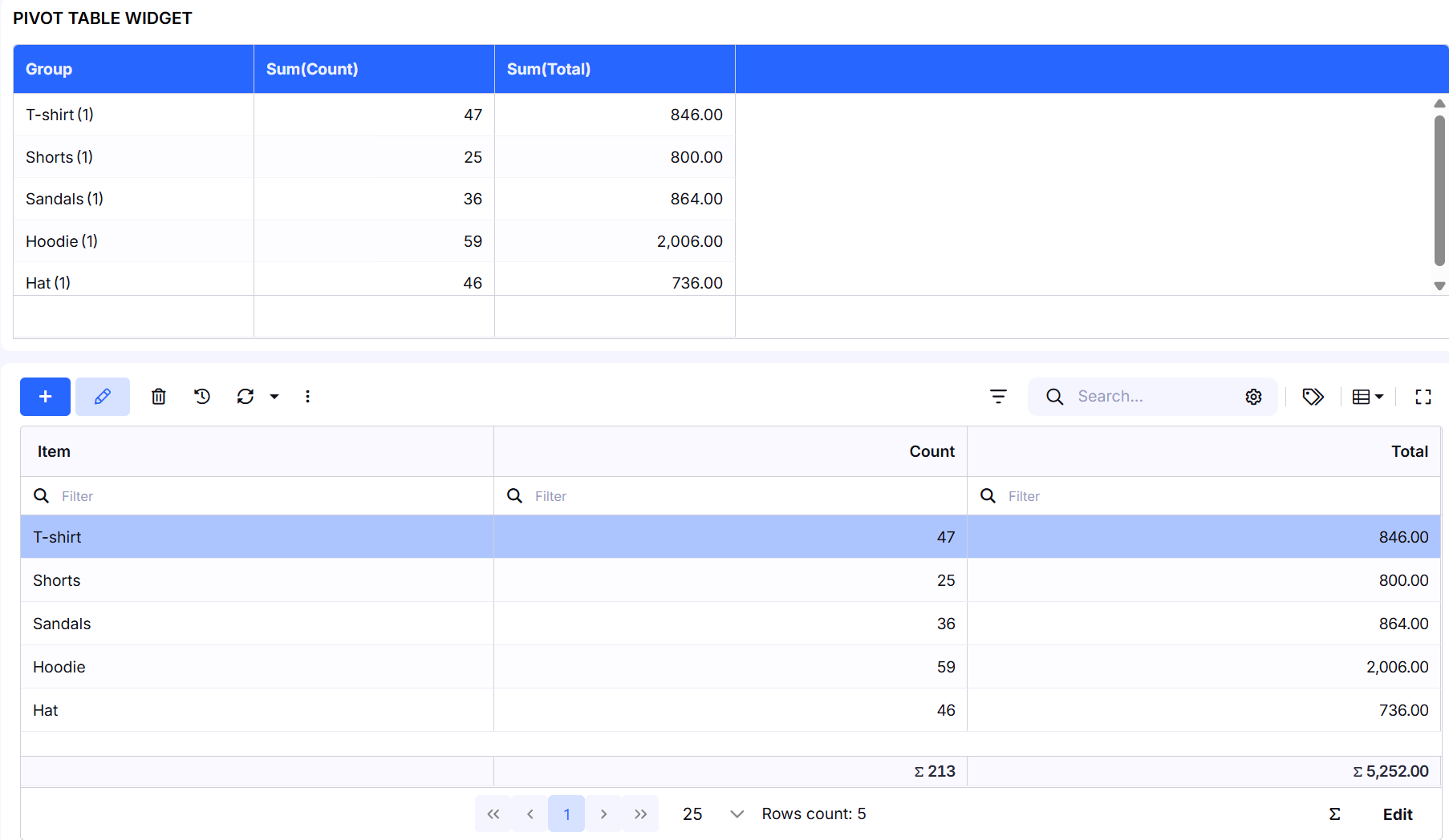
The Pivot Table Widget is a flexible and interactive data analysis tool that allows users to dynamically aggregate, group, and compare data from a selected table. Using drag & drop, the structure of the pivot table can be changed instantly without modifying the source data.
- The widget supports:
- row and column grouping,
- aggregation functions (Count, Sum, Average, etc.),
- calculated columns,
- filtering and export to Excel.

Widget Settings
Caption
- Custom name of the pivot table widget displayed on the dashboard.
Data from the Table
Select the table that provides the data for the pivot table. Only rows available within the current pricing plan are loaded (e.g. Free plan – up to 1000 rows). The pivot table works only with the loaded data.
Choose Fields
Select fields that will be available in the pivot table. Selected fields can later be used as:
- Row Groups,
- Column Labels,
- Values (aggregated metrics).
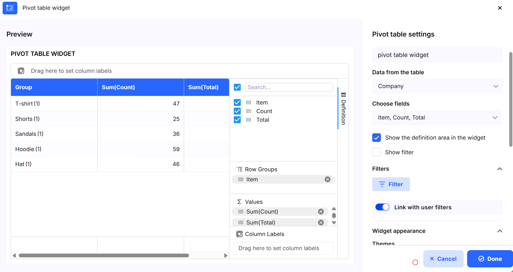
Definition (Pivot Structure)
The Definition panel allows users to define and modify the pivot table structure directly inside the widget using drag & drop.
Row Groups
Fields dropped here define row-based grouping of the data (e.g. Company, Category, Status).
Column Labels
Fields dropped here define column-based grouping. Columns are generated dynamically based on distinct values in the data.
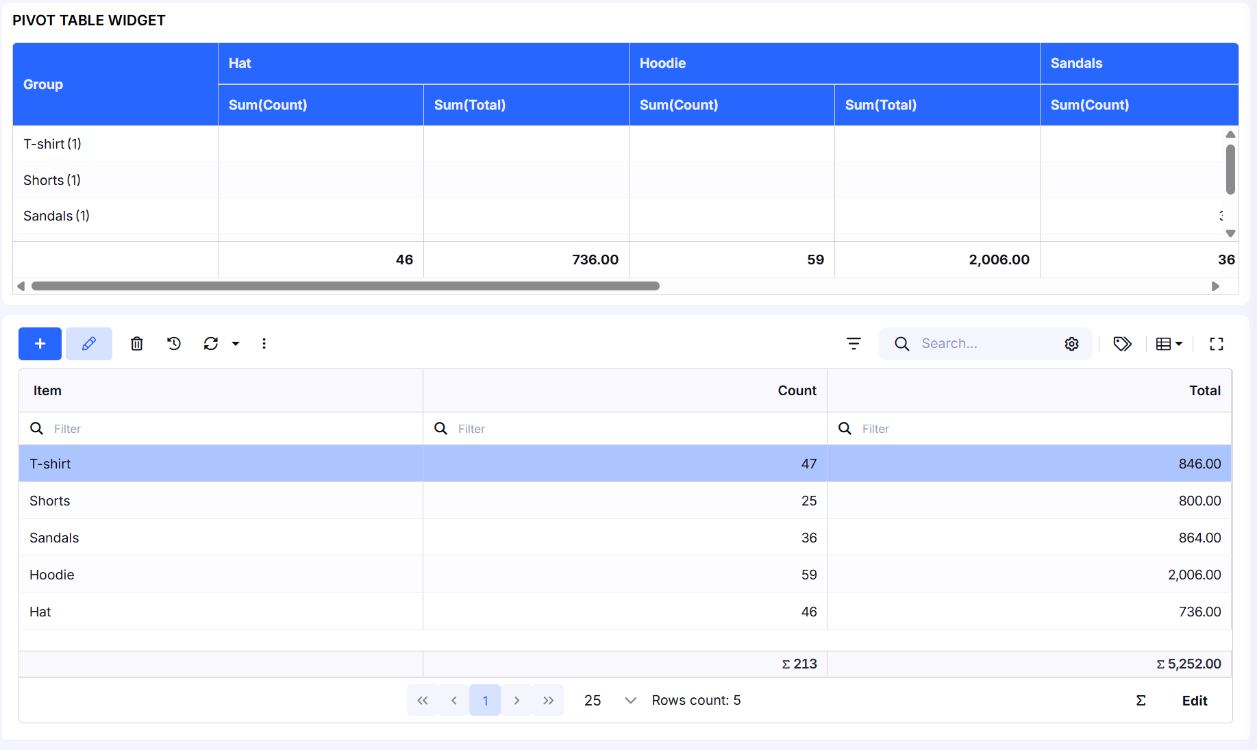
Values
Fields placed in Values are aggregated using one of the supported functions:
- Count
- Sum
- Average
- Minimum
- Maximum
- First
- Last
Multiple value fields can be used at the same time (for example: Count of Contacts and Count of Companies).
Working with Columns
Column Context Menu
Each column provides a context menu with the following actions:
- Rename / Edit – rename the column or adjust its settings
- Group by – group data by the selected field
- Remove from values – remove the column from aggregated values
- Add to labels – use the field as a Row Group or Column Label
Calculated Columns
Pivot tables support custom calculated columns for advanced analysis.
Add Calculated Column
When adding a calculated column, the following options are available:
- Column Label
Name of the calculated column displayed in the pivot table. - Calculation Type
- Row from data source – calculation is performed on individual source rows (before aggregation)
- Row from pivot – after aggregation – calculation is performed on already aggregated pivot values
- Formula editor
Editor for defining the formula (e.g. ratios, percentages, or combinations of aggregated values). - Decimal places
Defines the number of decimal places for the result. - Use thousand separator
Enables or disables the thousand separator for numeric values.
Filtering and Display
Show Definition Area in the Widget
Displays the Definition panel on the right side of the widget, allowing users to modify the pivot structure directly using drag & drop.
- Show Filter
- Displays search and filtering controls above the pivot table. Filters can also be linked with user filters on the dashboard.
Filters
- Allows applying conditions to limit the dataset before it is displayed in the pivot table.
Export and Table Options
Excel
- Show Row Stripes – enables alternating row stripes for better readability
- Export to Excel – exports the current pivot table view to an Excel file
Widget Appearance
- Theme – select a visual theme (Primary, Gray, Primary light, etc.)
- Negative numbers in red – display negative values in red
- Background – widget background color
- Widget Information – additional description or notes using a rich text editor
- Hide widget on small screens – hides the widget on small devices
Typical Use Cases
- Sales Analysis – revenue and order counts by category or time period
- CRM Dashboards – number of contacts vs. companies, deal status overviews
- Internal Reporting – record summaries by type, status, or responsible user
The Pivot Table Widget enables users to build powerful analytical reports without coding and significantly improves data transparency on dashboards.